1. 
2.
3. 
4. 
5. 
6. 
7. 
8. 
9. 
10. 
11. 
12. 

13. 
14. 
15. 
Self portrait #1
Self portrait #2 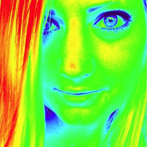
I am a person who finds passion in color and strongly relate the two. I feel that color sparks certain emotions in people that let them truly express themselves. I tried to take pictures this week of things in everyday life that ignited these feelings.
Hey Kat! I really liked your pictures this week. Your Construction was okay. The first picture has the number to the left of it but the rest have the number above. For Communication, I enjoyed the city-feel. I felt like I was walking around Philly with you and seeing the day through your eyes. I also liked that the apps you used did not take away or distract from the photo itself (except the second self-portrait). I thought your Conception was well done. I really liked the diverse use of color. You have some pictures that were full of color and others that had one stand-out color, which made your blog interesting. I also enjoyed that you had a variety of close-up and far-away pictures. My vote for Picture of the week is #3. The peppers are naturally beautiful in color, and I think you captured that really well. Awesome job!
ReplyDeleteHello. Cool photos this week. I like the composition of all your photos. They capture the subjects really well. I've never been a big fan of super blown out colors but you pulled it off nicely here. Picture #3 and #5 are good examples of a lot of color that doesn't take away from the photo too much. My favorite photo from your set is photo #3. There is a lot of color and the subject is different. Good job this week.
ReplyDeleteHey!
ReplyDeleteBased on the construction of your photos, it looks like you were looking up at your surroundings a lot this week. You have a variety of perspective, mostly from above and below.
I like that you're trying to communication emotion through the color in your photos. #12 and #13 make me feel super peaceful because of the dim lighting, and colors that are not overbearingly bright.
These hit a lot of the photo cliches, unfortunately, so I'm not quite sure what you were going for conceptually besides provoking emotion through color. Do you look for color in moments that look drab in life? It's hard to tell what exactly draws you to what's in the photos you shot.
Although it can be classified as a photo cliche, my favorite photo is #9. The way you edited the photo really makes the blues and reds/oranges in this photo stand out, which almost makes it look surreal.
Hello Kat,
ReplyDeleteThe construction was okay, the pictures were aligned left when they should be centered. Otherwise they were numbered and spaced fine.
Your communication was good, took photos around the city and other places that you enjoy (like the beach.) You tried to make your photos have something in them that is eye catching.
Your conception was good. You got up close for some photos and some were far away. For #10 you wanted to capture the rush of people going where they need to go.
My favorite photo is #13. I really like bright colors like that when the blend together. The surrounding area is a dark color that really makes it stick out.
Hi Kat! For your construction, your pictures are numbered, however, they’re all centered to the left. It would be easier to view if they were centered and evenly spaced. Also, it would have been nice to see the pictures in a larger view. For your communication, your pictures were easy to read. I like the variety of colors you were able to capture in your pictures. I especially like picture 13 because in addition to the pink and red color taking up most of the shot, you can see a glimmer or orange as well as the white light reflecting a blue hue. For the conception of your pictures, it seems like you shot things that you saw on your daily travels. I like the way certain pictures consist of objects that are displayed in a haphazard manner, such as in picture 6 and picture 7. My vote for POW is picture 3 because I like the way you enhanced the peppers’ natural color using a blue tint. It’s so vibrant and enticing!
ReplyDeleteThis comment has been removed by the author.
ReplyDeleteHi Kat,
ReplyDeleteI can see that your pictures need to be centered. That being said, you have chosen bright colorful objects to have in your pictures. Your photos are varied with familiar and unfamiliar. I don't know what #5 is, but is interesting. Your second self-portrait shows that you can manipulate color in your pictures. It looks like you were taking pictures of things you see everyday.
I really liked the giant blue and red paintbrush a stroke of color.
ReplyDeleteHey Kat,
ReplyDeleteLoved your photos this week. I agree that your pictures should be centered and I enjoy the overall theme you portrayted this week. I liked how you communicated the color and energy in every day life through your various activities! For content, I liked all your pictures I can tell your interested in many different things. I also liked how each pictures was edited differently, making your blog diversified and exciting from one picture to the next. My favorite picture for the week is photo #3. I like the way the peppers pop out at you!
Hey Kat!
ReplyDeleteFirst off, #13 was by far my favorite photo for the week. That's just my personal color preferences speaking here, but it was also clear, crisp, and not giving off the appearance of over-saturation or too much edition. A lot of your photos are extremely saturated and low-contrast, which kind of drew my attention away from the subject matter and the way you composed and framed the shots. I'd like to see what happens when you play a bit less with artificiality and go the opposite direction, perhaps? Regardless, your sense of color is intriguing, and I can't wait to see where you go next.
Hey Kat,
ReplyDeleteYour construction is nice this week! I can see a lot of intentional framing of your subjects. The saturation levels of your photos are obviously boosted up, but it makes everything look great. I'm especially font of photo 3 because of the repetition with the pepper shape, but the variation in color. One thing I would do for the next assignment is to get people's faces in the shot if you're going to be taking people-watching-esque photos. I just think it would add more interest.