form - Good that I can see both horizontal and vertical photographs. Last two pictures do not have a number and you need to upload one more self-portrait. Pictures should be centered on this blog, too, and you need to put the same space between them.
content - You chose colorful topics. I don't know, however, if you can take a picture of other people's artwork such as #5 and #11 (next to the flag picture).
impact - I wish I could see a more focused picture #2 because it seems blurry a little. On the last picture I pay more attention to metal pipe on the right bottom (could be because of my weird personality lol). Also editing each picture could have made them more colorful.
I like picture #10 because they have different colors by each flag.
Hi Judith, your construction starts off good but isn't consistent throughout your whole piece. Some of the numbers aren't centered directly above the photo, and your last few photos aren't centered or labeled. Your communication is great, I understand what you like doing after seeing these photos. Your hobbies and lifestyle are communicated through them. Your conception is good. These photos seem to be about simple parts of your everyday life. I can tell they were either taken at your home or places you visit or pass by often. My favorite photo is number 5 because I love elephants.
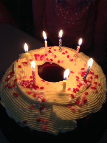
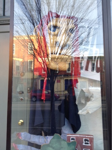
Hi Judith! For your construction, most of your pictures are centered and numbered, but it trails off at the end of your post. Also, most of your pictures are vertical, so adding some more horizontal shots next time would add some more variety. For your communication, I get a pretty good sense of who you are and what you like to do! Picture 13 looks like a store that you could have passed on your way home. I like how even though the reflection of the tree takes over the focus of the picture, you can still see a splash of red on the figure in the display case. For the conception, your pictures seem to be of objects in your house and places you visit daily. I like the variety in textures that you shot, such as in your last picture (beige bag with flowers on it) and the apples in picture 8. My vote for POW is picture 1. I really like the way the light reflects on the cake. It’s so simple and comforting. It reminds me of having birthday parties as a little kid.
Hello Judith, The construction was okay, the pictures were centered and everything, but the numbering was not consistent. Your communication was good, it looks like you took pictures of things you saw everyday and caught your attention or you thought were interesting. Your conception was great. It seems like you really tried to include red in a lot of your photos because it's a bright passionate color. My favorite photo is #7. It reminds me of one of my favorite movie series, Insidious.
Hi! I liked your construction at the beginning, but make sure you are consistent throughout. This just makes it more organized for viewers. I liked the variety in your photos this week. I could tell that you tried to find the color in everyday objects and scenes. However, I would like to see more variety in your angles and viewpoints! I would have also like to see the photos edited a bit more to really make the colors pop. My favorite picture is number 3! I really like how the different directions of the books adds dimension to the photos and the various colors really stand out!
I really liked your pictures this week, they were great to look at! For construction, I would just recommend staying consistent throughout to keep the viewers eye on the picture and now the numbering. Your communication was good, I feel like I got a good grasp on what your interests are and what you're passionate about. That's why my favorite picture is photo number 3! Because while books can be boring to some people, I found the different colors demonstrated the excitement and joy of reading! For content, I would like to see some pictures with different angle!


Hi Judith!
ReplyDeleteform - Good that I can see both horizontal and vertical photographs. Last two pictures do not have a number and you need to upload one more self-portrait. Pictures should be centered on this blog, too, and you need to put the same space between them.
content - You chose colorful topics. I don't know, however, if you can take a picture of other people's artwork such as #5 and #11 (next to the flag picture).
impact - I wish I could see a more focused picture #2 because it seems blurry a little. On the last picture I pay more attention to metal pipe on the right bottom (could be because of my weird personality lol). Also editing each picture could have made them more colorful.
I like picture #10 because they have different colors by each flag.
Hi Judith, your construction starts off good but isn't consistent throughout your whole piece. Some of the numbers aren't centered directly above the photo, and your last few photos aren't centered or labeled. Your communication is great, I understand what you like doing after seeing these photos. Your hobbies and lifestyle are communicated through them. Your conception is good. These photos seem to be about simple parts of your everyday life. I can tell they were either taken at your home or places you visit or pass by often. My favorite photo is number 5 because I love elephants.
ReplyDeleteHi Judith! For your construction, most of your pictures are centered and numbered, but it trails off at the end of your post. Also, most of your pictures are vertical, so adding some more horizontal shots next time would add some more variety. For your communication, I get a pretty good sense of who you are and what you like to do! Picture 13 looks like a store that you could have passed on your way home. I like how even though the reflection of the tree takes over the focus of the picture, you can still see a splash of red on the figure in the display case. For the conception, your pictures seem to be of objects in your house and places you visit daily. I like the variety in textures that you shot, such as in your last picture (beige bag with flowers on it) and the apples in picture 8. My vote for POW is picture 1. I really like the way the light reflects on the cake. It’s so simple and comforting. It reminds me of having birthday parties as a little kid.
ReplyDeleteHello Judith,
ReplyDeleteThe construction was okay, the pictures were centered and everything, but the numbering was not consistent.
Your communication was good, it looks like you took pictures of things you saw everyday and caught your attention or you thought were interesting.
Your conception was great. It seems like you really tried to include red in a lot of your photos because it's a bright passionate color.
My favorite photo is #7. It reminds me of one of my favorite movie series, Insidious.
Hi! I liked your construction at the beginning, but make sure you are consistent throughout. This just makes it more organized for viewers. I liked the variety in your photos this week. I could tell that you tried to find the color in everyday objects and scenes. However, I would like to see more variety in your angles and viewpoints! I would have also like to see the photos edited a bit more to really make the colors pop. My favorite picture is number 3! I really like how the different directions of the books adds dimension to the photos and the various colors really stand out!
ReplyDeleteHey Judith,
ReplyDeleteI really liked your pictures this week, they were great to look at! For construction, I would just recommend staying consistent throughout to keep the viewers eye on the picture and now the numbering. Your communication was good, I feel like I got a good grasp on what your interests are and what you're passionate about. That's why my favorite picture is photo number 3! Because while books can be boring to some people, I found the different colors demonstrated the excitement and joy of reading! For content, I would like to see some pictures with different angle!