| one |

| two |

| three |


| five |

| six |


| eight |

| nine |

| ten |

| eleven |

| twelve |

| thirteen |


| fifteen |

| sixteen |


| seventeen |

| eighteen |

| self portrait one |

| self portrait two |
| technical notes |
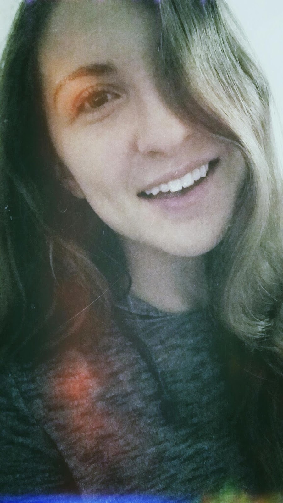
I used Snapseed for almost all of these photos because of my newfound love for the photo editing app - the possibilities for photo editing are endless, especially when it comes to vintage. I used "Grainy Film" filters on Snapseed for many of these because of how many options there were, and how well they worked with the photos. I really, really love vintage, and vintage-looking things, and I think this series of photos shows the different perspectives I have on the word "vintage." I really like the 70's, so I tried to make my first self portrait look like I'm in that time period, and like a photo someone found in an old memory box. I tried to make my second self portrait look like a picture that someone might have had in their wallet for a long time.
The grainy look of your pictures certainly adds to the vintage feel.You have a variety of photos that confirm your interest in vintage objects. Your enthusiasm for the assignment shows.The pictures are centered. The numbers are as well. I'll have to try Snapseed again on your recommendation.
ReplyDeleteThis comment has been removed by the author.
ReplyDeleteHi Francesca! Good construction on your post. I like the creative number layout. The way you edited your photos do a great job of making them look like photos taken from an old film SLR and not a cell phone. It's cool that you have a different subject for each photo, except ESP. Everybody went to ESP this week. Conceptually your pictures do a good job of putting the viewer in another time period. Nothing sticks out as super new or very modern. I like that you focused on objects that are not new. My favorite picture is #13. The simplicity of the photo is great as everybody has photos filled with clutter and junk. To see a photo of just a lamp post and the night sky sticks out like a sore thumb.
ReplyDeleteHey Francesca,
ReplyDeleteThe construction was great, everything was centered, numbered, and spaced the same. I still love your numbering style.
Your communication was great. I could see you were trying to capture in your photos, but some of them still told mysterious photos.
Your conception was good. You really captured vintage and memory topic in all your photos. I think some photos could have been edited to look a little "older"/vintage (less clear and HD) though, like photo #3.
My favorite photo is #16. It brings me back to the Wildwood boardwalk when I was a kid and always wanted to play at the arcade. Your filter just brings the photo out really well.
Hi Francesca! For your construction, all of your pictures are numbered, evenly spaced, and centered and you have a variety of horizontal and vertical pictures. I also like the way you grouped your pictures together according to their color schemes. For your communication, you did great! I always look forward to your pictures because you always manage to take some really creative shots. Your various angles and variety of edits you made really enhanced the vintage quality of typical, day-to-day objects and locations. I especially liked picture #13 because its so simple and modern, yet the angle the edits you made have made it look vintage. For the conception of your pictures, it looks like you tried to shoot objects and locations that aren’t necessarily vintage on their own, but with your unique angles and edits, you made them vintage. My vote for POW is picture #1 because it almost seems like the city is actually gray, but in the far distance, the color begins to appear again. It reminds me of one of the “Halloween Town” movies where the town was gray for a period of the movie. Overall, great job!
ReplyDeleteFrancesca,
ReplyDeleteYour construction is great! I like the way you numbered you photos, something that I started doing in my own blog. Your communication is meaningful as well. I could tell you were trying to tell specific stories or show specific interests in you pictures. For example, the second picture shows me you like to read and tied back to my memories of reading and favorite books. You did a great job capturing color within your pictures while keeping them vintage. And for that reason my favorite is picture 17 this week because it had great color for a vintage photo but also tied back to a lot of memories from childhood!
Allison
Francesca,
ReplyDeleteYour photos this week are awesome! I can really tell that your enjoyed shooting this topic and had interest in vintage things. The construction is great and I really like how you numbered your pictures. You were able to capture your subjects in a way that makes the photos interesting and evokes a certain emotion. I feel a sense of memory and can tell that there is history behind these subjects. I also like how you not only shot subjects that appeared to be vintage, but also edited them in a way that enhanced this. You really have a way of shooting at angles that keeps viewers interested and wanting to see more of your photos. My favorite is number five! I like how the spiral draws viewers eyes in and makes them question what exactly they are looking at. You captured the dimension in that I can't tell the true depth of the subject.
Hey Francesca! You took some really cool photos this week. Your Construction was great. Your pictures were centered, evenly spaced, and numbered. As far as your Communication, it was good. I think you definitely captured the “vintage” theme. The use of lighting and filters helped create the vintage feeling in your pictures. I also got a city vibe, which made your blog cohesive. I felt like you were taking me on a tour. Your Conception was great. The variety of angles, distances, and colors made looking through your blog interesting. It was hard to choose my favorite picture (you had so many good ones!) but I’m voting for #5. The railing is just a classic look. The curve draws my eye around the entire picture. I like the angle from above. The filter makes the floor and railing look older. I also like the contrast between the light staircase and dark floor. Great job this week!
ReplyDeleteHi Francesca!
ReplyDeleteform - They all are centered and it is great you uploaded both vertical and horizontal photographs.
content - You show black and white, color and passion, and vintage topic on your pictures such as #12. #13, and #17. #5 looks very classy with the object and angle. Overall I like your choice of objects but I wanted to see your work with a non-vintage object, too.
impact - The mysterious picture #7, #12, and #13 are great. #7's object's impact is really big to me. The background and the shape of the plant's combination scares me a little bit and that shows how difficult to take a mysterious photograph with an object that we see in our daily life. I think your editing and angle were great.
So, I like #7 the most!