1 |
2
 |
3
 |
4
 |
5
 |
6
 |
7 |
 |
8
 |
9 |
 |
10
 |
11
 12 |
 |
13  |

15

16

17

18

SP 1

Recipe: For these photos, I tried to either make the either the subject or the editing be vintage. I found some items around my house and when I was out in the city that I thought were vintage because nobody uses them anymore. To create a faded and old effect on my photos, I used several different apps: VSCO cam, Pixlr, Vintage Cam, and Vintage It.
This comment has been removed by the author.
ReplyDeleteHi Annie,
DeleteI started my original comments too early before I could see all of the pictures. Your construction is correct. The way you organized the pictures makes it easy to follow what you are communicating. I like the Game Boy in front of the laptop the best, depicting vintage and modern technology. Showing pictures of the concert tickets is a great way to bring back memories to the observer of the concerts they have attended.
Hi Annie,
ReplyDeleteThe construction was good, everything was centered, numbered, and spaced the same. The actual photo sizes are a little small though.
Your communication was good. Some of your photos were a little obvious, but still gave off the vintage vibe. I still enjoyed looking at the photos and seeing what you were trying to capture and a lot of them really felt vintage to me.
Your conception was good. I'm glad I'm not the only one who liked to use frames to give off a vintage vibe. I think you could have gotten a little closer to some of the objects or edited them to more than just washed out.
My favorite photo is #11. I remember my first concert and have a lot of tickets stuffed in my desk from concerts and Flyers games. Those kind of things are always a great memory.
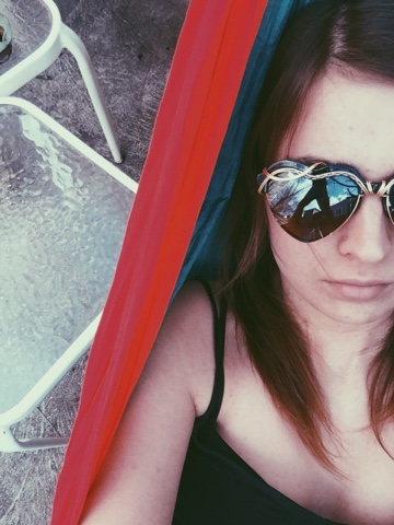
Hi Annie! For your construction, all of your pictures, evenly spaced, and numbered. You also have a variety of horizontal and vertical pictures. I also like the way you started off with a lot of pictures that were lacking in color and then gradually added pictures with color. For your communication, almost all of your pictures can easily be identified and read (#13 stumped me!). Picture #12 definitely resonated with me because I had the game boy growing up, except mine was green. For the conception of your pictures, it’s clear that you shot objects and locations in your everyday surroundings. It would have been nice to see pictures that you aren’t always surrounded by though. I like that you took pictures of objects that we don’t typically use as often anymore (pictures #1, #2, #4, and #9 in particular). My vote for POW is your second self-portrait because there’s a lot going on that made me stop and appreciate all of the details. I like how the red part of the hammock pops out significantly in the pictures, as well as the reflection in your sunglasses. There’s also the glass table in the background with something on one of them that I can’t quite make out, which definitely added some mystery.
ReplyDeleteAnnie,
ReplyDeleteYou construction was great. I especially liked the borders around your photos which made them stand out a little more. You communication was also great. Each of your pictures centered around a different topic, and memory which drew me in. Your content was also great. I liked each picture and what is communicated and the vintage feel it had along with it. For this reason, my favorite picture this week is picture 11 because I feel like it did a great job of capturing a story within a vintage photo.
Allison
Hi Annie!
ReplyDeleteThe construction of your photos is good. I like that we're seeing your life from different perspectives. #18 stands out to me because I feel like no one has shot from this perspective, or constructed a photo this way, so it definitely adds to the mystery.
Your communication is a bit mixed. Some photos are giving me this sense of being in a different time, but others just look like you may have taken the shot because it "looked cool." # 11 reminds me of summer. I try to go to as many concerts as I can, and this brings back memories of how it feels to get the tickets in the mail, and to keep them afterwards.
In terms of conception, it shows that you love music, and you love your cat. At times, it felt like some pictures were taken because they had to be. So I think it would be interesting to see more passion through some of these pictures, even if that means more having to do with your interest in music.
My favorite picture is #16 because of the use of effects, having browns and reds stand out, and how you faded the picture. You still have me guessing on what's going on in this picture, too.
Annie,
ReplyDeleteThe construction of your photos is good with your pictures centered and consistent. I like your variety of horizontal and vertical pictures as well. I definitely got the sense of memory from your pictures! You conveyed your message well and I could tell that your subjects had meaning to you! However, I think if you shot them at different angles or maybe set up the pictures differently, it would make them a little more interesting. I do like the way you edited your pictures, it gave off the vintage feel! My favorite picture is number 18! I like the different angle you too in order to make the words more apparent.
Hey Annie,
ReplyDeleteYour photos, as per usually, were really well organized and constructed, for the most part. When it comes to the communicative aspects of this photo set, a lot of them were really expected and kind of hard to follow... how do they tie into the topic for the past few weeks? What are you trying to tell me or make me feel? That was hard to discern, and it got a bit distracting. I sense maybe the pressure to edit them to look "vintage" made you struggle a bit – I totally understand that, trust me, this was a puzzler.
My favorite photo is #14. There's this really ephemeral, dreamlike, and fantastical quality to it that makes me feel like I'm entering into a hazy fairytale, with the moss and the trees. I kind of wish you'd taken that aesthetic and run with it.
Hi Annie!
ReplyDeleteform - They all are centered and you uploaded both vertical and horizontal photographs! The square shape ones are good, too.
content - I like that you show "black and white," "color and passion," and "vintage and memory" from your works. It definitely tells us you have learned in class and practiced them all like #6, #10 and #12.
impact - Many of your pictures have vintage atmosphere. Are #1 and #7 from your memory?
I like #4. Old flavor from the public phone, black and white like color, mysterious black smoke-like stuff on the top right (or somebody touched the glass using a finger?) and my most favorite is the angle. The wall's vertical line is not straight and that's the biggest reason.